Hg London
Shaping the Future: A Seamless and Inclusive Space for Hg
At Hg London, brandx designed an authentic space that reflects the evolving nature of work and the future Hg envisions. Spanning two floors, Hg’s brand seamlessly transitions from the digital to the physical environment, with a human touch that feels both natural and genuine.
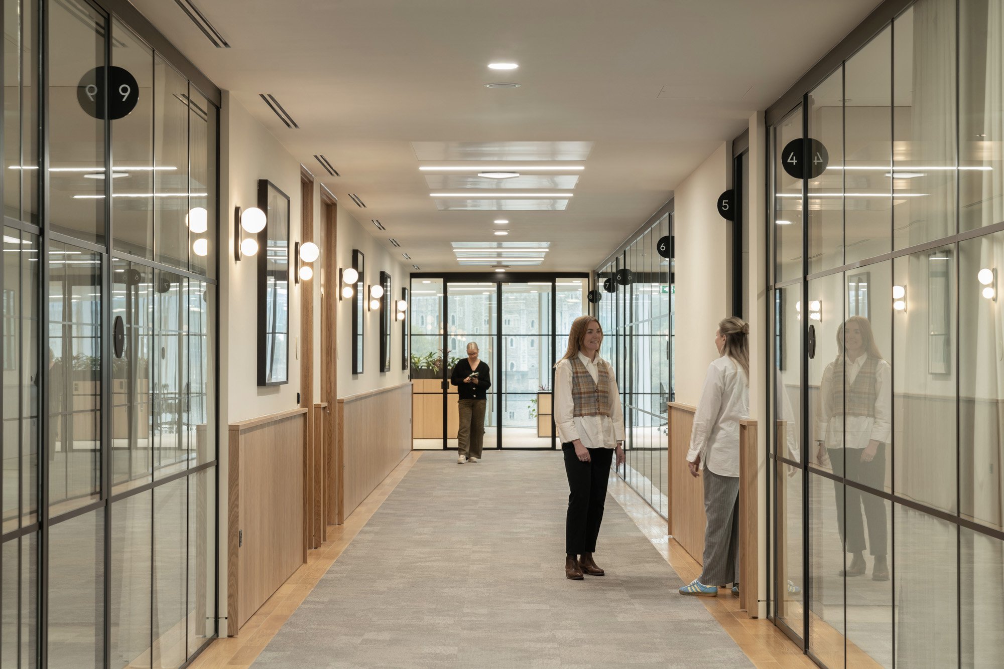
A key challenge was ensuring clear wayfinding while maintaining consistency with the global brand identity, and keeping a strong connection to the local context. In addition to intuitive signage, brandx incorporated Braille and tactile text to enhance accessibility for all users. This thoughtful integration underscores the brand’s commitment to inclusivity and strengthens the design’s alignment with both global standards and the local environment.
Sector: Fintech
Size: 44,000 sf
Location(s): London, UK


Crafting Clarity: Landmarks, Crystal Clear Design, The Connecting Dot, and Timeless Endurance

Landmarks as Wayfinding: Connecting Space, Context, and Creativity
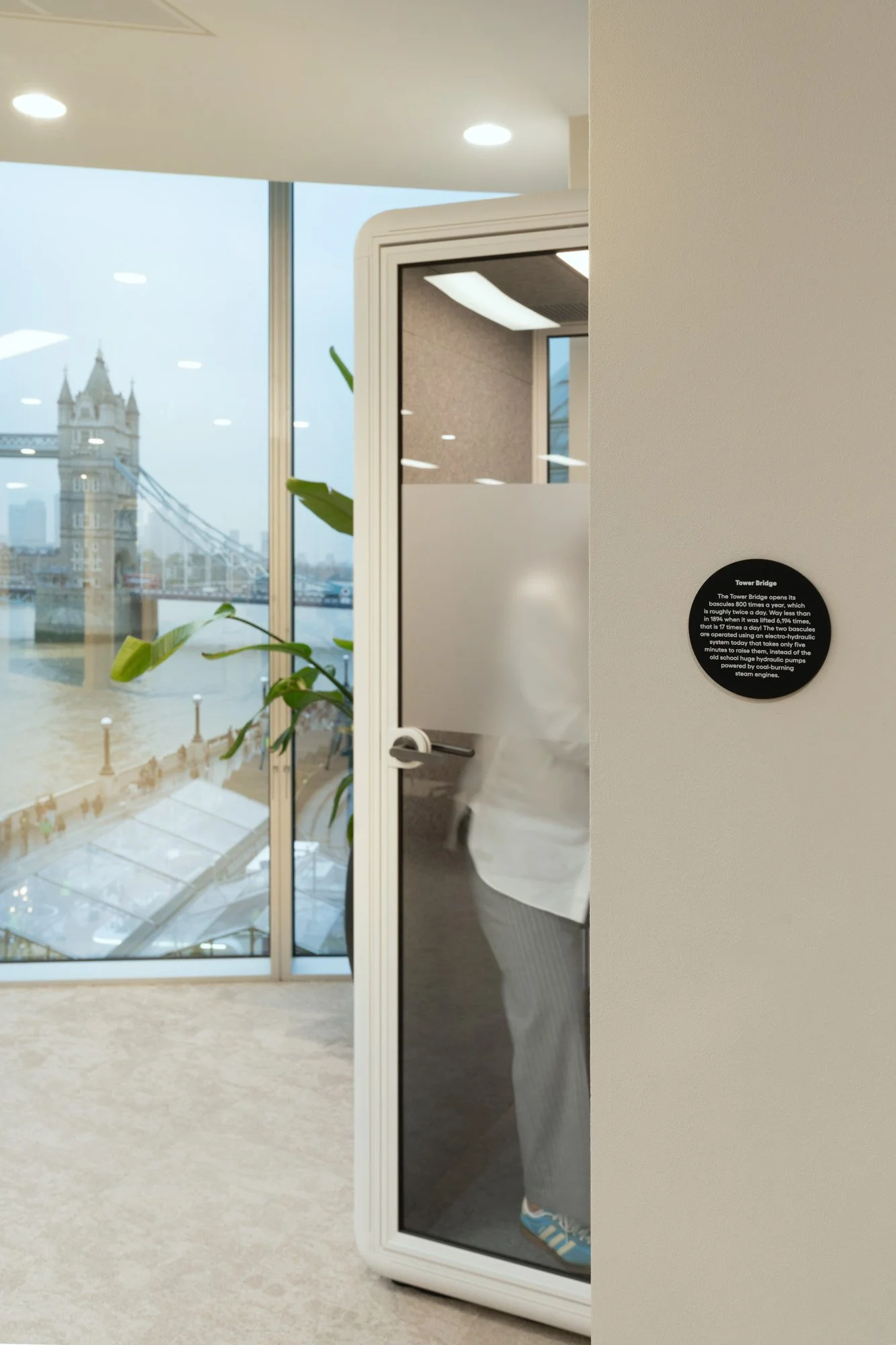
Each building section is assigned a landmark, inspired by the visual connections through the windows—such as the Thames, Tower Bridge, Borough Market, and the HMS Belfast. This ties the design to its surrounding context. This approach extends across the two floors, serving as a wayfinding tool that enhances both the local environment and the company’s creativity and innovation.
Infographics are strategically placed as small "Easter eggs," which further highlight these landmarks and offer a unique learning experience for those in the space.


Crystal Clear Design: Bridging the Digital and Physical Worlds of Hg
The design reflects Hg’s brand essence and resilience through elements inspired by glass, a common material which is used in software. This is achieved using various glass films that emphasize key qualities, such as dispersion effects with gradients, light reflections through fluted glass, and overlays with a dotted pattern. The simple dotted effect subtly references software and data, bridging the digital and physical spaces in a tangible way.
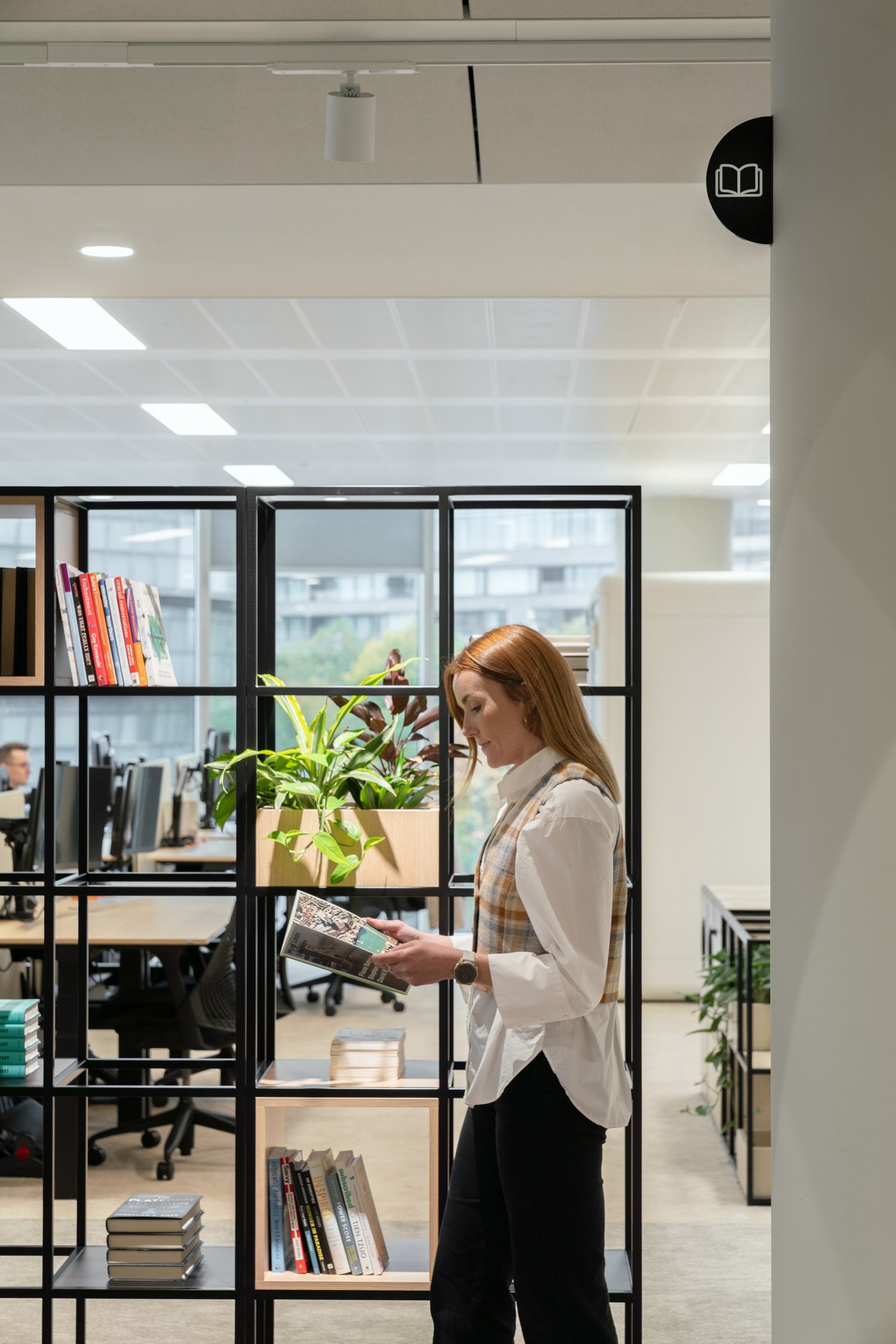
This circular motif extends into the signage and wayfinding, providing a cohesive visual element that enhances navigation. Even the finer details, such as the custom icon library and the Gelix font used throughout the signage, contribute to a unified and consistent brand experience.


Timeless Endurance: Designing Trust and Elegance for Hg
With over 30 years of stability and experience, Hg remains dedicated to investing in the future. The goal of this design was to craft an environment that blends subtle and strong elegance, evoking a sense of calm and tranquility. Through carefully considered design elements, we sought to symbolize trusted endurance and a lasting commitment to excellence.


